全國統一招生熱線
0755-86191118
首先說明的是,我們做APP開發,Tab分頁不管是頂部還是底部,都是必不可少的,網上也有太多太多的實現方式了,我在這里總結一下:
第一種方式: TabHost原始方式:
這里實現的是底部菜單:
布局文件:(我們通過RelativeLayout 可以把TabWidget定位在底部)
android:layout_width="fill_parent"
android:layout_height="fill_parent" >
android:layout_width="fill_parent"
android:layout_height="fill_parent"
android:orientation="vertical"
android:padding="3dp" >
<framelayout< p=""> </framelayout<>
android:id="@android:id/tabcontent"
android:layout_width="fill_parent"
android:layout_height="fill_parent"
android:layout_weight="1" >
android:id="@android:id/tabs"
android:layout_width="fill_parent"
android:layout_height="wrap_content"
android:layout_alignBottom="@android:id/tabcontent"
android:background="@drawable/tabbar_bg" />
在這里我們將說明一下:之前我是獲取到TabWidget的view試圖及內部icon和title,然后控制實現其效果,但是我們也可以用另外一種方式,也就是我們調用TabHost.TabSpec 的setIndicator(View view);這個方法,我們可以定制顯示的view,
代碼片段:
/***
* 創建footerview
*/
public void createFooterView() {
tabHost = getTabHost(); // The activity TabHost
view = new TabView(this, R.drawable.tabbar_icon_home,
R.drawable.tabbar_icon_home_selecotr);
view.setBackgroundDrawable(this.getResources().getDrawable(
R.drawable.footer_view_selector));
intent = new Intent(MainActivity.this, HomeActivity.class);
spec = tabHost.newTabSpec("num1").setIndicator(view).setContent(intent);
tabHost.addTab(spec);
view = new TabView(this, R.drawable.tabbar_icon_search,
R.drawable.tabbar_icon_search_selecotr);
view.setBackgroundDrawable(this.getResources().getDrawable(
R.drawable.footer_view_selector));
intent = new Intent(MainActivity.this, HomeActivity.class);
spec = tabHost.newTabSpec("num2").setIndicator(view).setContent(intent);
tabHost.addTab(spec);
view = new TabView(this, R.drawable.tabbar_icon_cart,
R.drawable.tabbar_icon_cart_selector);
view.setBackgroundDrawable(this.getResources().getDrawable(
R.drawable.footer_view_selector));
intent = new Intent(MainActivity.this, HomeActivity.class);
spec = tabHost.newTabSpec("num3").setIndicator(view).setContent(intent);
tabHost.addTab(spec);
view = new TabView(this, R.drawable.tabbar_icon_more,
R.drawable.tabbar_icon_more_selecotr);
view.setBackgroundDrawable(this.getResources().getDrawable(
R.drawable.footer_view_selector));
intent = new Intent(MainActivity.this, HomeActivity.class);
spec = tabHost.newTabSpec("num4").setIndicator(view).setContent(intent);
tabHost.addTab(spec);
}
/***
* 自定義view
*
*/
class TabView extends LinearLayout {
ImageView imageView;
public TabView(Context c, int drawable, int drawableselec) {
super(c);
imageView = new ImageView(c);
// 可以定制點擊后狀態
StateListDrawable listDrawable = new StateListDrawable();
// 未選
listDrawable.addState(SELECTED_STATE_SET, this.getResources()
.getDrawable(drawableselec));
// 選擇
listDrawable.addState(ENABLED_STATE_SET, this.getResources()
.getDrawable(drawable));
imageView.setImageDrawable(listDrawable);// 引用 StateListDrawable
setGravity(Gravity.CENTER);
addView(imageView);
}
}
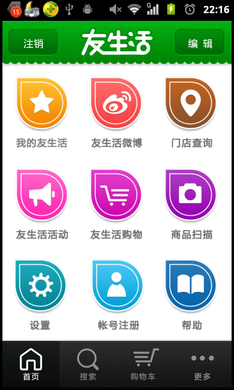
這樣我們就實現想要的效果了.(建議使用這種方法,我的項目就是用的這個實現的.)
如果我是圖標和文字分開的,我們也可以用(RadioButton代替,也許大家都不陌生,一會我簡單介紹下)

這個源碼是因為項目里面用的。有時間整理下上傳上去,不過我相信大家看過都會做出來的.
第二種方法:GridView+ActivityGroup (圖片 ,文字)
(為了省事,我把上下tab分頁整理到一個demo里面了.)
這個的布局文件我就不顯示了,因為比較簡單,我們還是來看代碼吧.
代碼片段:
/***
* 適配器
*
* @author Administrator
*
*/
public class ImageAdapter extends BaseAdapter {
private Context mContext;
private ImageTextButton[] imgItems;
private int selResId;
/***
*
* @param c
* @param picIds
* @param titles
* @param width
* @param height
* @param selResId
*/
public ImageAdapter(Context c, int[] picIds, String titles[], int width,
int height, int selResId) {
mContext = c;
this.selResId = selResId;
imgItems = new ImageTextButton[picIds.length];
for (int i = 0; i < picIds.length; i++) {
imgItems[i] = new ImageTextButton(mContext);
imgItems[i]
.setLayoutParams(new GridView.LayoutParams(width, height));// 設置ImageView寬高
imgItems[i].setPadding(2, 2, 2, 2);
// 顯示圖片與文本
imgItems[i].setImageResource(picIds[i], titles[i]);
}
}
@Override
public int getCount() {
return imgItems.length;
}
@Override
public Object getItem(int position) {
return position;
}
@Override
public long getItemId(int position) {
return position;
}
/***
* 設置選中后的效果
*/
public void SetFocus(int index) {
for (int i = 0; i < imgItems.length; i++) {
// 先把所有設為最初狀態
if (i != index) {
imgItems[i].setBackgroundResource(0);// 回到最初樣式
}
}
// 選中設置
imgItems[index].setBackgroundResource(selResId);
}
@Override
public View getView(int position, View convertView, ViewGroup parent) {
ImageTextButton imageView;
if (convertView == null) {
imageView = imgItems[position];
} else {
imageView = (ImageTextButton) convertView;
}
return imageView;
}
}
在這里我們用到了自定義控件,其實就是把imageview 和textview 整到一起了
/***
* 自定義控件(圖片文字)
*/
public class ImageTextButton extends LinearLayout {
private ImageView button = null;
private TextView text = null;
private Context context;
public ImageTextButton(Context context) {
this(context, null);
this.context = context;
}
public ImageTextButton(Context context, AttributeSet attrs) {
super(context, attrs);
LayoutInflater.from(context).inflate(R.layout.imagetextbutton, this,
true);
button = (ImageView) this.findViewById(R.id.button);
text = (TextView) this.findViewById(R.id.btnText);
text.setSingleLine(true);
}
public void setImageResource(int image_id, String title) {
Bitmap bitmap = BitmapFactory.decodeResource(context.getResources(),
image_id);
button.setBackgroundDrawable(new BitmapDrawable(bitmap));
text.setText(title);
}
public void setImageBitmap(Bitmap bitmap) {
if (button != null)
button.setImageBitmap(bitmap);
}
public void setBackgroundDrawable(Drawable drawable, int Width, int Hdight) {
if (button != null) {
button.setBackgroundDrawable(drawable);
button.setMinimumHeight(Hdight);
button.setMinimumWidth(Width);
}
}
public void setText(String title) {
if (text != null)
text.setText(title);
}
public void setText(int ResID) {
if (text != null)
text.setText(ResID);
}
public void setWidth(int width) {
button.setMaxWidth(width);
}
public void setHeight(int height) {
button.setMaxHeight(height);
}
}
我們只需要在oncreate中調用即可:
@Override
public void onCreate(Bundle savedInstanceState) {
super.onCreate(savedInstanceState);
setContentView(R.layout.main);
Navigation_Top_Bar = (GridView) this
.findViewById(R.id.Navigation_Top_Bar);
Navigation_Buttom_Bar = (GridView) this
.findViewById(R.id.Navigation_Buttom_Bar);
// 獲取顯示寬度
int width = this.getWindowManager().getDefaultDisplay().getWidth()
/ topbar_image_array.length;
topImgAdapter1 = new ImageAdapter(this, topbar_image_array, titles,
width, 100, R.drawable.cover);
Init(Navigation_Top_Bar, topImgAdapter1);
ButtomImgAdapter2 = new ImageAdapter(this, topbar_image_array, titles,
width, 100, R.drawable.cover);
Init(Navigation_Buttom_Bar, ButtomImgAdapter2);
}
這個實現起來有點復雜,不過用習慣了會覺得別有一翻風味的.我之前就一直用這個方法.
在這里我要說明一點:
imgItems[i].setLayoutParams(new GridView.LayoutParams(width, height));// 設置ImageView寬高
其他的都是細節上的問題,我想你們看過都會ok的.
效果圖:
(怎么樣,效果還不錯吧。就是實現起來有點負責,不過習慣就好.)
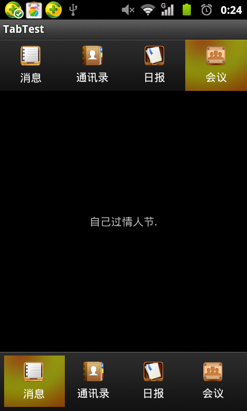
第三種方法:ActivityGroup+一些TextView布局.(在這里我們自定實現動態滾動效果)
詳情請查看前面一片文章:android 分頁Title欄滑塊效果--ActionBar(模擬網易 騰訊等動態效果)
分頁Tab的實現方法和上面方法類是,都是運用ActivityGroup的性質,而上面是通過GridView生成,而我們這邊是我們自定義View控件實現.
這里我主要說一下怎樣實現ActionBar:
代碼片段:
/***
* 自定義控件
*
* @author zhangjia
*
* 在這里我要說明一點 我們在創建RectF矩形的時候,
*
* 參照物原點是所在"父控件的左上角".
*
*/
public class ActionBar extends LinearLayout implements OnClickListener {
private ImageView tv1;
private ImageView tv2;
private ImageView tv3;
private ImageView tv4;
private Paint paint;// 畫筆
private RectF curRectF;// draw當前bar
private RectF tarRectF;// draw被點擊bar
private final int space_x = 0;// 相當于pading.
private final int space_y = 0;// 相當于pading
private final double step = 32;// 速度step.
public ActionBar(Context context) {
super(context);
}
/***
* 構造方法
*
* @param context
* @param attrs
*/
public ActionBar(Context context, AttributeSet attrs) {
super(context, attrs);
setWillNotDraw(false);
LayoutInflater.from(context).inflate(R.layout.action_bar, this, true);
paint = new Paint();
paint.setAntiAlias(true);
tv1 = (ImageView) findViewById(R.id.tv1);
tv2 = (ImageView) findViewById(R.id.tv2);
tv3 = (ImageView) findViewById(R.id.tv3);
tv4 = (ImageView) findViewById(R.id.tv4);
tv1.setOnClickListener(this);
tv2.setOnClickListener(this);
tv3.setOnClickListener(this);
tv4.setOnClickListener(this);
curRectF = null;
tarRectF = null;
}
/***
* invalidate():調用這個方法會執行onDraw()方法,但是前提是:自己把invalidate()方法執行結束在進行執行.
*/
@Override
protected void onDraw(Canvas canvas) {
super.onDraw(canvas);
canvas.drawColor(Color.BLACK);
paint.setColor(Color.RED);
// 如果當前curRectF=null,也就是第一次訪問,則默認為draw第一個bar
if (curRectF == null)
curRectF = new RectF(tv1.getLeft() + space_x, tv1.getTop()
+ space_y, tv1.getRight() - space_x, tv1.getBottom()
- space_y);
// 第一次方位tarRectF=null,默認為draw
if (tarRectF == null)
tarRectF = new RectF(tv1.getLeft() + space_x, tv1.getTop()
+ space_y, tv1.getRight() - space_x, tv1.getBottom()
- space_y);
/***
* 作用:如果在這個范圍內則,以這個為最終位置,(不明的白的話,你可以把這個注釋運行下你就知道why了.)
*/
if (Math.abs(curRectF.left - tarRectF.left) < step) {
curRectF.left = tarRectF.left;
curRectF.right = tarRectF.right;
}
/***
* 說明目標在當前的左側,需要向左移動(每次矩形移動step,則進行invalidate(),從新進行移動...)
*/
if (curRectF.left > tarRectF.left) {
curRectF.left -= step;
curRectF.right -= step;
invalidate();// 繼續刷新,從而實現滑動效果,每次step32.
}
/***
* 說明目標在當前的右側,需要向右移動(每次矩形移動step,則進行invalidate(),從新進行移動...)
*/
else if (curRectF.left < tarRectF.left) {
curRectF.left += step;
curRectF.right += step;
invalidate();
}
// canvas.drawRect(curRectF, paint);
// 參數,矩形,弧度,畫筆
canvas.drawRoundRect(curRectF, 5, 5, paint);
}
/****
* 這里要記錄目標矩形的坐標
*/
@Override
public void onClick(View v) {
tarRectF.left = v.getLeft() + space_x;
tarRectF.right = v.getRight() - space_x;
invalidate();// 刷新
System.out.println("tarRectF.top=" + tarRectF.top + ",v.getTop()="
+ v.getTop() + ", v.getBottom()" + v.getBottom());
}
}
上面已經講的很詳細了,就不啰嗦了.
效果圖:
大致就這么多了。
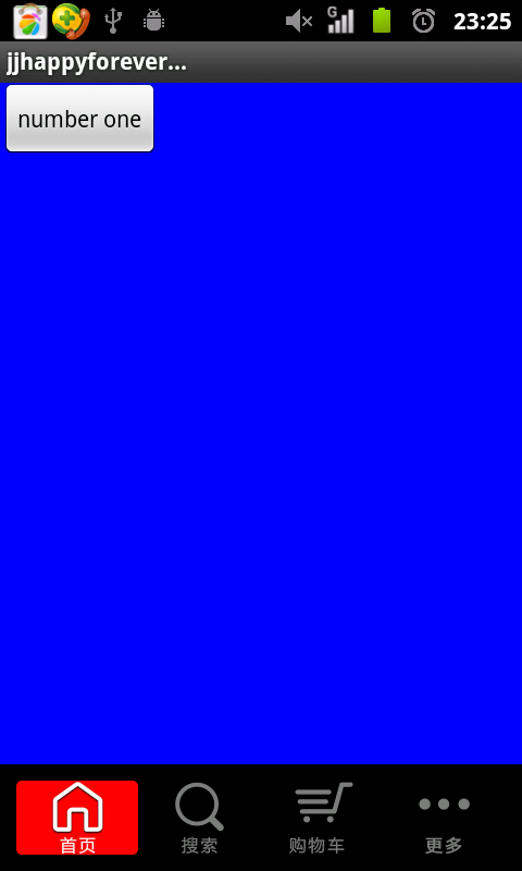
額外:還有一點就是有的會用到RadioButton這個控件,其實就是對其進行了一些調整,這里我簡單說明一下應用:
可以取消button樣式,用android:drawableTop顯示圖片,從而達到想要的效果.
xmlns:tools="http://schemas.android.com/tools"
android:layout_width="match_parent"
android:layout_height="match_parent" >
android:layout_width="fill_parent"
android:layout_height="wrap_content"
android:layout_gravity="bottom"
android:background="@drawable/maintab_toolbar_bg"
android:gravity="center"
android:orientation="horizontal" >
android:id="@+id/button1"
android:layout_width="match_parent"
android:layout_height="match_parent"
android:layout_gravity="center"
android:layout_weight="1"
android:background="@drawable/home_btn_bg"
android:button="@null"
android:drawableTop="@drawable/icon_1_n"
android:gravity="center"
android:paddingTop="5dp"
android:text="首頁"
android:textSize="12sp" />
android:id="@+id/button2"
android:layout_width="match_parent"
android:layout_height="match_parent"
android:layout_weight="1"
android:background="@drawable/home_btn_bg"
android:button="@null"
android:drawableTop="@drawable/icon_2_n"
android:gravity="center"
android:paddingTop="5dp"
android:text="短信"
android:textSize="12sp" />
android:id="@+id/button3"
android:layout_width="match_parent"
android:layout_height="match_parent"
android:layout_weight="1"
android:background="@drawable/home_btn_bg"
android:button="@null"
android:drawableTop="@drawable/icon_3_n"
android:gravity="center"
android:paddingTop="5dp"
android:text="聯系人"
android:textSize="12sp" />
android:id="@+id/button4"
android:layout_width="match_parent"
android:layout_height="match_parent"
android:layout_weight="1"
android:background="@drawable/home_btn_bg"
android:button="@null"
android:drawableTop="@drawable/icon_4_n"
android:gravity="center"
android:paddingTop="5dp"
android:text="搜索"
android:textSize="12sp" />
這里我們還需要selector.xml
實現點擊效果.
示例圖:
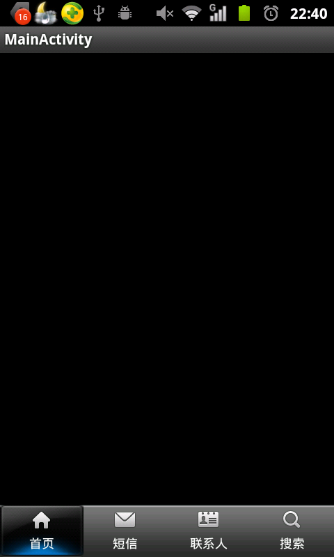
就說這么多了,情況因人而異.。
【北大青鳥深圳嘉華】